About Mobile Responsive Web Sites
What is Mobile Responsive Web (aka RWD), and why to use it?....
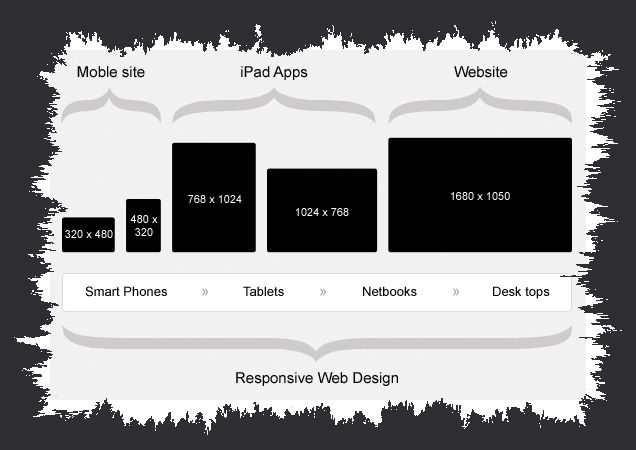
The Mobile Responsive Web design (aka RWD) approach is aimed at crafting sites to provide an optimal viewing experience easy reading and navigation with a minimum of re-sizing, panning, and scrolling across a wide range of devices (from mobile phones to desktop computer monitors).
A site designed with RWD adapts the layout to the viewing environment by using fluid, proportion based grids, flexible images, and CSS3 media queries, an extension of the "media rule'.
Due to the enormous and everyday use of "Smart Phones" and tablets, Mobile Responsive Design format (RWD) is becoming the daily choice for existing and new clients.